The tonal sweatshirt: artistic direction
Tenth post in “Tools I build with.” A lot of brand decisions are about absence. What gets left off the garment is louder than what gets put on it. This post is the artistic direction for the numbered Lunaire sweatshirt: why the embroidery is tonal, why the chest and the sleeve use different fonts on purpose, and the small typographic decisions that an embroidery machine forgives or punishes.
Tonal on tonal as the brand voice
The whole garment is black. The embroidery is also black, in a slightly different black thread on a slightly different black fabric. From two metres away the design is barely visible. The wearer notices it. The friend close enough to read the chest notices it. The Instagram crop notices it because the camera pulls thread sheen out of the matte cotton. The casual passer-by notices nothing. That asymmetry, where you only see the brand if you are close enough to be told, is the quiet-luxury cue Lunaire is choosing.
The reference points are well-rehearsed: Margiela’s blank stitched tab on the back of the neck, Yohji’s embroidered Y3 logo half-lost in the seam, Lemaire’s tonal labels, Toogood’s washed-out marks. Streetwear runs the opposite direction (the Supreme box, the Off-White quotation marks, Palace’s tri-ferg). Both are valid, neither is timeless, and the Lunaire decision is to live in the quiet camp because the brand voice is generative-per-order, not loud-per-launch. A loud chest print on a one-of-one piece feels mismatched. A quiet chest mark on a one-of-one piece feels considered.
One concrete consequence: Printful’s mockup-renderer artificially boosts the contrast on tonal embroidery so the design is legible on a product page. The actual stitched garment is more subtle than any preview shows. This is fine for the brand and slightly inconvenient for marketing photography, where the chest mark genuinely needs side lighting to read. The fix is in the photography, not the design.
The chest: Heavitas, locked
The chest carries the wordmark. Heavitas (the typeface chosen in episode 08) is a condensed-caps display face with chiselled terminals and high contrast. It sits at the confident end of contemporary-premium typography, between Jacquemus’s skinny serif and Balenciaga’s tracked sans. Tonal embroidery sands off some of Heavitas’s sharper details (chiselled corners blur slightly in stitch), but the silhouette of the word survives, which is what the chest needs to do.
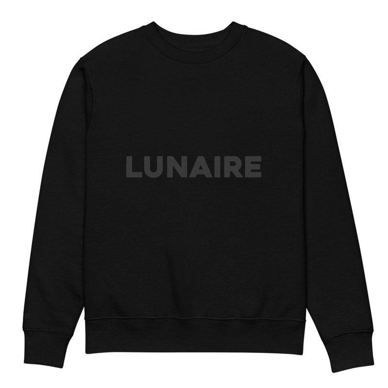
Honest open question, still being worked: the kerning of LUNAIRE in this exact size, on this exact placement, is not perfect yet. The NA pair tightens slightly more than the UN pair, which is normal Heavitas behaviour at display sizes but reads off when shrunk to chest scale. The next iteration manually kerns each pair (probably half a unit looser between NA) before the file gets re-uploaded. It is the kind of small design fix that matters more than people expect: a slightly-off wordmark is the first thing the eye picks at on a luxury garment, even before it is conscious of why.
The sleeve: the real personalisation
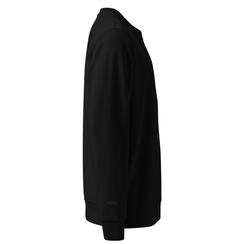
The actual one-of-one detail is on the right wrist: a three-digit edition number prefixed with #, embroidered in the same tonal black, sized so the wearer’s own hand sometimes covers it. The chest is the brand. The sleeve is the buyer.
This is where Lunaire’s premise (generative per-order, episode 05b) actually shows up on a piece. The buyer picks a number on the reservation form, the server renders that number into a PNG at order time, and Printful stitches it into the right sleeve of one specific garment that ships to that one specific buyer. Editions 1 to 999. Each number sells once.
What the # is doing there
The hash mark is a real brand decision, not a default. Three formats survive an honest test for a numbered edition.
| Reads as | Cultural register | Embroidery cost | |
|---|---|---|---|
#042 |
Internet-native, drop culture, claim-a-number | Streetwear / web-native premium | Cheap, no fragile glyphs |
N° 042 or № 042 |
Heritage edition, gallery print, fragrance | Old-luxury houses, Hermès / Chanel | The superscript ring on № is fragile under embroidery |
042 / 999 |
Art edition, declared cap, scarcity is the message | Galleries, signed prints, watch references | Cheap, but the slash needs careful kerning |
Lunaire picked # for two reasons. First, it matches the brand voice (generative, per-order, web-native) better than the heritage N° framing claims a continuity Lunaire does not have. Second, it survives embroidery cleanly. The superscript ring on № is the textbook example of a glyph that does not survive: a 1mm circle of thread either closes into a dot on the first wash or splays outward and looks like a smudge. Killing the ring saves the design from a long argument with the embroidery machine.
The slash version (042 / 999) was the close runner-up and stays a candidate for a future second drop. Declaring the cap as part of the mark is a strong scarcity move that the # version leaves implicit.
Embroidery typography is not screen typography
The sleeve number is set in Concert One Regular, a chunky single-weight Google Font with rounded terminals. Why a different font from the chest is a fair question; the short answer is that Heavitas’s condensed numerals are too tight for a 0.75-inch sleeve embroidery. Concert One’s rounded letterforms have wider counters and more forgiving inner gaps, which is what the embroidery machine needs at small sizes. There is real genre tension between Heavitas (industrial, chiselled) and Concert One (rounded, friendly), and that tension is the deliberate part: the wordmark roars and the serial whispers, and the two jobs do not need to share a typeface.
The size is locked at 0.75 inches tall on the sleeve. The earlier 0.5-inch test choked the heavier weights (Helvetica Now Display Black filled in around the inner counters of 0, 8, and 9). Going up to 0.75 inches solves that without making the number loud. Concert One at 0.75 inches stitches cleanly and reads from a forearm-distance.
Two more decisions worth being explicit about:
- Letter-spacing. Concert One renders at default tracking on the embroidery file. A small positive nudge (around three to five per cent) would space the digits more deliberately and avoid the typeset-too-tight feel that bare three-digit numerals get on a sleeve. This is the next pass; the current file is the simpler default.
- Single locked font size for all 999 numbers. The render script uses a fixed font size (215 point in a 600 by 900 canvas, sized to fit the worst-case three-digit number, which turns out to be
#002because of Concert One’s wide zeros). Every customer gets a number at the same size; nobody’s#100is bigger than someone else’s#888. The implementation is in episode 12.
Three digits is a hard cap
Three digits caps the edition at 999 pieces, ever. Going to four digits later would visually break every prior owner’s number relative to the new ones. So the cap is a real decision, not a placeholder.
The argument for owning it: 999 is a legitimate scarcity story. It is small enough to feel limited (Hermès Birkin annual production runs in the low thousands per region) and large enough to be a real product line. Marketing copy gets a built-in hook: 999 sweatshirts, ever. A second drop later (different colour, different chest mark, different cap) is a separate edition with its own number range, not a continuation of this one.
The argument against: a brand might want to scale beyond 999 if it works. The honest counter to that is that Lunaire’s premise is generative-per-order, and the per-order layer (the birth-chart hoodie from episode 05b, the colour-picker phone case from 05c) does not need a cap at all. The numbered crewneck is the one piece in the catalogue where scarcity is the product. Capping the cap-piece is consistent.
What to be aware of
- Tonal embroidery photographs differently than it wears. Camera lighting picks up thread sheen that the human eye reads as nearly invisible. A product page shot under softbox lighting reads bolder than the actual garment on a body in afternoon daylight. Plan the photography around this: a side-lit, off-axis shot reads honestly; a flat front-lit shot oversells the embroidery.
- Embroidery shrinks fine details. Thread has thickness; thin lines come out thicker, small gaps close up. A digital design that looks balanced on screen comes out heavier in stitch unless the source file deliberately thins the thin bits and widens the gaps. The chest wordmark needed a thinner-weight Heavitas variant cut from the brand pack to stitch cleanly; the sleeve numerals work as drawn because Concert One is already a heavy face.
- Two fonts on one garment is a choice you have to commit to. Different genres of typeface fight by default; the only way to make them sit together is to give each a clear separate job. The wordmark is the brand voice, the serial is the buyer’s number, and the placements are far enough apart on the body that they never read in the same eyeline. This works on a sweatshirt where chest and sleeve are physically separated; it would not work on a t-shirt where chest and arm sit close together.
- Open issues are honest. The NA kerning on the chest and the small letter-spacing nudge on the sleeve are still on the to-do list at the time of writing. The journal records the state, not the polish.
What’s next in the series
- Building wearlunaire.com. Hero video, reservation form, no checkout yet, on top of an existing nginx container.
- Wiring the pipeline end-to-end. Form submit to draft order, with a real test case that actually lands in the Printful dashboard.
- Marketing without a budget. The hard part.
Subscribe below for the next one.