Visual identity and brand alignment
Eighth post in “Tools I build with.” Five things have to line up before a product ever ships: the brand name, the colours, the logo, the prices, and how findable the brand is online. This post is the checklist for that alignment, started the moment you decide what you are making, not the week before launch.
What a visual identity is
A visual identity is the set of design rules that make a brand recognisable before any product is read: the colours, the typography, the logo, the photography style, the shape of every page. A well-aligned visual identity means every touchpoint (site, social, packaging, emails, printed inserts) feels like the same brand speaking.
The cast is part of the visual identity too. The face of the person wearing the hoodie, using the phone, or standing next to the print is the visible answer to “who is this brand for?” Age, styling, setting, energy of the model all carry the brand’s positioning louder than any tagline. A hoodie modelled by a 20-year-old at a festival tells a different story from the same hoodie modelled by a 32-year-old in a quiet home office. Casting is not afterthought photography; it is the brand saying who it belongs with.
Brand alignment is when the visual identity, the pricing, the product quality, and the target buyer all point in the same direction. A €200 print on a bargain-site layout is misaligned. A €20 print on a gallery-grade layout is also misaligned. Alignment is the quiet thing that makes a buyer trust a small brand they have never heard of.
Finding the name
The name is the hinge. Visual identity, findability, pricing, everything that follows assumes the name is locked. Get the name wrong and the rest either rebrands or carries the wrong signal forever.
A name has two competing jobs. The first is brand: evocative, memorable, distinct, something a buyer says easily and recognises at a glance. Glossier, Jacquemus, Aesop, Hermès all win here; none of them describe what they sell. The second is SEO: findable, unambiguous in search, not colliding with an existing brand or a common word. “The Poster Club” is strong on SEO (a plain search for “poster club” lands the site) and weaker on brand distinction. “Lunaire” is strong on brand and weaker on SEO (an established US lingerie brand of the same name, over twenty years old, already owns the result page).
Neither job wins outright. Both matter, and the trade-off is real. Brand-first names need more SEO work to land (backlinks, consistent wording, a bio line that humans and search engines use to disambiguate). SEO-first names need more brand work to feel distinct (a strong logo, palette, and editorial voice to carry the weight the name does not). Pick the lane consciously, and plan for the half that does not come for free.
Before committing fully to a name, ten minutes of checks saves a rebrand later. The domain check comes first: every other concern is recoverable, domains are not. If the name you want is parked on a squatter’s page, you either pay their price or rename. Run this the day you pick a name, not the week you try to launch.
Lunaire is the cautionary example. A celestial imprint sketched in 2023, kept in a notes file for years. By 2026 every usable TLD for the word was gone: lunaire.com, lunaire.fr, lunaire.co.uk, lunaire.art, all registered, none of them pointing to a working brand. Parked pages, for-sale listings, squatter inventories. Nobody checked at naming time, and three years was long enough for every squatter in the world to notice the word too. Option A: pay the squatter’s asking price. Option B: rename. The lesson is not that Lunaire is a bad name. The lesson is that the day you commit to a name, you register the domain, or you pick another name.
In fairness, Lunaire fails both jobs at once: domain-squatted across the usable TLDs, fighting a twenty-year-old US lingerie brand for the result page. A textbook example of what not to do. This journal documents a real person building a personalised brand solo-handed, mistakes and all, and this is one of them. The salvage was a phrase-shift: wearlunaire.com, paired with @wearlunaire across the socials. The brand becomes an imperative, and the search term “wearlunaire” is not one the incumbent lingerie brand is competing for.
- Domain availability. Check the primary
.com, your preferred TLD, and the national variants of your main markets (.fr,.co.uk,.de). Register the main one the same day. For Lunaire the obvious TLDs were already gone by the time anyone looked, andwearlunaire.combecame the salvage: a phrase-shift that owns a distinct search term. A second TLD in reserve is cheap insurance against future squatters. - Social handle availability. The primary handle on Instagram, TikTok, X, Threads, LinkedIn, Pinterest, YouTube. Register every handle the same day as the domain, even the platforms not in the launch plan. They are free, and the squatter logic that applies to domains applies to handles too. For Lunaire, the short handles were already taken, so the fallback locked to
@wearlunaireacross the platforms, matched bywearlunaire.comas the primary domain. - Trademark databases. WIPO and national equivalents (INPI for France, IPO for the UK, USPTO for the US). Any existing mark in a related category is worth noting. For Lunaire, the US lingerie brand of the same name is the obvious first check: twenty-plus years of trading usually comes with registered marks in the clothing class, which could constrain what a new Lunaire label can safely claim in apparel.
- AEO check. Ask Claude or ChatGPT “what is Lunaire?” and read the answer. At the time of writing the answer centres on the US lingerie brand of the same name. That is the textbook AEO conflict this check is designed to catch, flagged at the right moment of the checklist.
Findability: SEO and AEO
Two kinds of search need attention.
SEO (search engine optimisation) is how the brand appears on Google, Bing, DuckDuckGo. Someone searches “mid-century generative prints Paris” and one hopes the label appears on page one. SEO for a small label is mostly about having clear, descriptive titles and descriptions on every product page, plus a small backlog of blog or journal posts that answer real questions about the work. AEO (answer engine optimisation) is the newer concern: how the brand appears when someone asks ChatGPT, Claude, or Gemini a question like “what are some small European labels doing generative prints in 2026?” Those models read public content and summarise. The same ingredients that help SEO help AEO: clear writing about what the brand does, on pages the crawlers can read. The wording that works for AEO is slightly different: tighter, more declarative, closer to answers than to marketing copy.
For a small label, the pragmatic target is findability for the brand name itself. When someone types the name into a search bar, the first three results should be the site, the primary social handle, and something editorial about the work. Nothing unrelated on the first page.
Brand colours and logo
Lunaire runs two palettes at once. The brand palette stays small and fixed: one background, one text colour, one accent, used the same way across the site, packaging, emails, every touchpoint. The product palette is larger: a set of pastel neons the buyer picks from to generate the dye pattern on their phone case. The trick is keeping those two worlds visually separate, so the brand stays quiet and the buyer’s colour choice is the loudest thing on the product page.
For the brand palette, the discipline is strict: two or three colours, used the same way everywhere. A primary, a secondary, a neutral. Anything beyond that tends to drift into inconsistency.
The logo carries a similar discipline. For a small label, a wordmark (the brand name set in a specific type treatment) is almost always the right call over a symbol. Wordmarks are cheaper to make, more recognisable at small sizes, and do not need explaining. Symbols only earn themselves after the brand is already known; they do not create recognition on their own.
Logo treatments cluster by market tier. The typography of a luxury house does not read the same as the typography of a mass retailer, and both signal their price point before a single product is loaded. The move for a new label is to pick the tier to sit in, then copy the typographic logic of that tier.
| Examples | Typeface family | Case | Tracking | Monogram or symbol | |
|---|---|---|---|---|---|
| Luxury heritage | Chanel, Dior, Hermès, Cartier | Classical serif (Dior, Hermès) or bold geometric sans (Chanel) | All caps | Medium to wide | Often (interlocking initials, crest) |
| Contemporary premium | Céline, Saint Laurent, Jacquemus, Balenciaga | Bold minimalist sans, stripped back | All caps | Tight | Rare |
| Craft / editorial | Aesop, Diptyque, Le Labo, Story MFG | Restrained serif, clean sans, or artisanal hand-drawn | All caps or sentence | Normal | Rare (or illustrative stamp) |
| DTC premium | Glossier, Everlane, Allbirds | Friendly sans, often lowercase | Lowercase or caps | Normal | Rare |
| Streetwear | Supreme, Palace, Stüssy, BAPE, Off-White | Bold geometric sans (Futura Heavy) or hand-drawn script | All caps (box) or mixed (hand-drawn) | Tight | Box lockup is the signature; also tri-ferg, crown, ape head |
| Fast fashion / mass | Zara, H&M, Uniqlo, Shein | Mixed: tight-set serif, italic serif, bold sans | All caps | Normal; Zara overlaps (negative tracking) | Rare (Uniqlo is the box exception) |
The exercise for a new label: pick the tier that matches the intended price point. Open dafont.com, search the typeface family that matches the tier (“bold sans” for contemporary premium or streetwear, “classical serif” for luxury heritage, “friendly sans” for DTC premium). Set the brand name as the preview text and scroll through twenty options. A shortlist of two or three emerges quickly, and the choice is now conscious rather than instinctive.
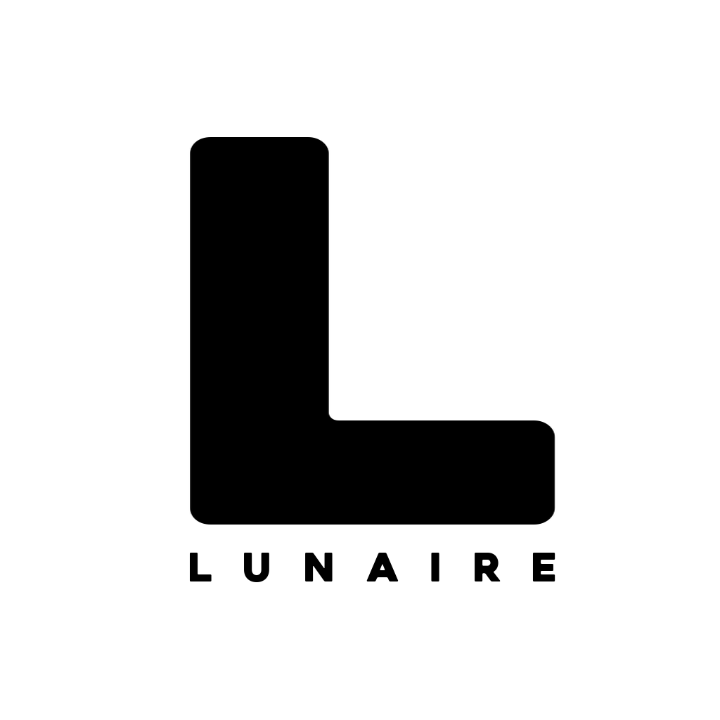
For Lunaire, the pick was Heavitas, a condensed-caps display face from dafont.com that sits the brand at the confident end of the contemporary-premium tier. The commercial licence was paid directly to the designer: most dafont.com faces are free for personal use, but a brand wordmark is commercial use, and the small one-off fee is cheap insurance against a later takedown request.
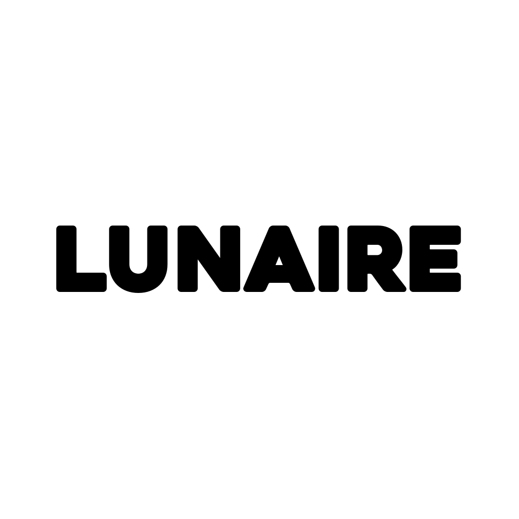
For small-format use (Instagram profile, favicon, email signature, an embroidered tag on a Lunaire garment), the wordmark reduces to a single-letter monogram with the full wordmark in non-bold Heavitas underneath. The L alone reads at 32 pixels (favicon size); the lockup reads at social-profile size; the full treatment is what ends up embroidered on apparel.
The colours and the logo, together, are the fastest way a visitor answers the question “is this brand for me?” Get them aligned, or get ready for a higher bounce rate.
Pricing as part of the brand
A defensible price has four layers. Leave any one out and the price is half-right.
- Cost of goods. PoD base cost + packaging. From the benchmark in episode 06.
- Payment and currency fees. Roughly 1.5% to 3% per sale for European cards, more for international. From the comparison in episode 07.
- VAT owed. Depending on the seller’s country and the customer’s country. For a French seller above the VAT threshold selling to the EU, 20% of the relevant portion.
- Target margin. The amount left for the seller, which funds the art time, the server, the generator, everything else.
Price = cost + fees + tax + target margin, rounded to a psychologically clean number (€27 rather than €26.40; €35 rather than €34.80). Round up, not down, when close.
Above the arithmetic sits the alignment check. Does the price match the quality the brand visually promises? A €30 personalised phone case on a gallery-grade site reads underpriced for the craft the brand is claiming. A €110 phone case on a cluttered site stacked with discount banners reads overpriced for what the visitor actually sees. The number has to agree with what the rest of the brand says about itself.
Comparing to the visual neighbours usually surfaces this tension. If Lunaire’s realistic price for a personalised embroidered hoodie lands at £60 but the craft-apparel neighbourhood sits closer to £150, either the price is wrong or the brand presentation is. Fix whichever is cheaper to fix.
What to be aware of
- Visual misalignment is a silent margin killer. A premium price on a bargain-looking site converts worse than a bargain price on a premium-looking site. The brand presentation is the pricing floor, not the other way round.
- A clean search today is not a clean search in six months. Someone else can pick the same name tomorrow. Move fast on social handles even if the site launch is weeks away.
- AEO is not SEO. Same content, different audience. SEO writes for search engines; AEO writes for question-asking AIs. Practical overlap is large; wording nuances differ.
- Discounting loudly is hard to reverse. A newsletter signup code is fine. A permanent “first print 50% off” banner trains buyers to wait for the next sale. Start at the price you want, not the one you hope to reach.
- Do not surprise buyers with shipping at the basket. Seeing €27 on the product page and €34 at checkout is a reliable way to lose the sale. Bundle shipping into the displayed price (with “free delivery” messaging), or show the all-in total before the add-to-basket click. The conversion cost of a surprise fee is bigger than the fee itself.
- Round up. €27 reads cleaner than €26.40, and the €0.60 difference compounds across a catalogue.
What’s next in the series
- Generating the art with Claude Code, pushing to Drive. The engine behind the Avant-Garde pieces, and where the raw exports live before curation.
- …and more tools ahead, each tied to a real project as its receipt.
Subscribe below for the next one.